Text Button |
 |
A text button acts like a momentary button and is used in practice to trigger an action when pressed. The Jamba text button extends the CTextButton view to:
In addition to the behavior provided by CTextButton, this class adds the following functionality:
- have a (potentially) dynamic title tied to a parameter (via
title-tag/TextButtonView::fTitleTag) - handle click conveniently (either inherit from this class and implement
onClick(), or provide anonClicklistener) - optionally handle image (3 states : disabled / off / on)
In addition to the attributes exposed by CTextButton, this class exposes the following attributes:
| Attribute | Description |
|---|---|
title-tag |
Optional id of the parameter whose string representation (IGUIParameter::toUTF8String()) will be used as the title for this button. |
disabled-text-color |
Color used to draw the title when no image is provided and the button is disabled. |
disabled-gradient |
Gradient used to draw the button when no image is provided and the button is disabled. |
button-image |
The image for the button (2 or 3 frames). |
button-image-has-disabled-state |
Used when drawing the image. If true, the image contains a disabled state (3 frames) otherwise it doesn’t (2 frames). |
precision-override |
Allow to override the precision of the parameter. If set to its default (-1), lets the parameter determine what the precision is (when displaying numbers), but if set >= 0 it will use the attribute value instead. |
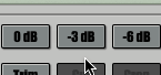
The image above shows an example of 3 text buttons which when clicked each perform a different action (in this case normalize to 0dB (resp. -3dB and -6dB) the sample). None of the button is tied to any (vst or jmb) parameter because we only care about doing an action when pressed. For this we register a listener.
Example
The json defining the 3 text buttons (Source)
"children": {
	"jamba::TextButton": {
		"attributes": {
			"button-image": "action_norm_0dB",
			"button-image-has-disabled-state": "true",
			"class": "jamba::TextButton",
			"custom-view-tag": "CustomView_Normalize0Action",
			"default-value": "0.5",
			"disabled-text-color": "~ WhiteCColor",
			"editor-mode": "false",
			"font": "~ NormalFont",
			"frame-color": "~ TransparentCColor",
			"frame-color-highlighted": "~ TransparentCColor",
			"frame-width": "1",
			"icon-position": "left",
			"icon-text-margin": "0",
			"kick-style": "true",
			"max-value": "1",
			"min-value": "0",
			"mouse-enabled": "true",
			"opacity": "1",
			"origin": "15, 1",
			"precision-override": "-1",
			"round-radius": "2",
			"size": "48, 26",
			"text-alignment": "center",
			"text-color": "~ BlackCColor",
			"text-color-highlighted": "~ WhiteCColor",
			"title": "0dB",
			"transparent": "false",
			"wants-focus": "true",
			"wheel-inc-value": "0.1"
		}
	},
	"jamba::TextButton": {
		"attributes": {
			"button-image": "action_norm_3dB",
			"button-image-has-disabled-state": "true",
			"class": "jamba::TextButton",
			"custom-view-tag": "CustomView_Normalize3Action",
			"default-value": "0.5",
			"disabled-text-color": "~ WhiteCColor",
			"editor-mode": "false",
			"font": "~ NormalFont",
			"frame-color": "~ TransparentCColor",
			"frame-color-highlighted": "~ TransparentCColor",
			"frame-width": "1",
			"icon-position": "left",
			"icon-text-margin": "0",
			"kick-style": "true",
			"max-value": "1",
			"min-value": "0",
			"mouse-enabled": "true",
			"opacity": "1",
			"origin": "65, 1",
			"precision-override": "-1",
			"round-radius": "2",
			"size": "48, 26",
			"text-alignment": "center",
			"text-color": "~ BlackCColor",
			"text-color-highlighted": "~ WhiteCColor",
			"title": "-3dB",
			"transparent": "false",
			"wants-focus": "true",
			"wheel-inc-value": "0.1"
		}
	},
	"jamba::TextButton": {
		"attributes": {
			"button-image": "action_norm_6dB",
			"button-image-has-disabled-state": "true",
			"class": "jamba::TextButton",
			"custom-view-tag": "CustomView_Normalize6Action",
			"default-value": "0.5",
			"disabled-text-color": "~ WhiteCColor",
			"editor-mode": "false",
			"font": "~ NormalFont",
			"frame-color": "~ TransparentCColor",
			"frame-color-highlighted": "~ TransparentCColor",
			"frame-width": "1",
			"icon-position": "left",
			"icon-text-margin": "0",
			"kick-style": "true",
			"max-value": "1",
			"min-value": "0",
			"mouse-enabled": "true",
			"opacity": "1",
			"origin": "115, 1",
			"precision-override": "-1",
			"round-radius": "2",
			"size": "48, 26",
			"text-alignment": "center",
			"text-color": "~ BlackCColor",
			"text-color-highlighted": "~ WhiteCColor",
			"title": "-6dB",
			"transparent": "false",
			"wants-focus": "true",
			"wheel-inc-value": "0.1"
		}
	},
The listeners are registered in the (sub) controller (as can be seen in the XML section above, the 3 buttons are contained in a CViewContainer where the sub controller is defined as SampleEditController) (Source)
CView *SampleEditController::verifyView(CView *iView,
                                        const UIAttributes &iAttributes,
                                        const IUIDescription * /* iDescription */)
{
  auto button = dynamic_cast<Views::TextButtonView *>(iView);

  if(button)
  {
    switch(button->getCustomViewTag())
    {
      case ESampleSplitterParamID::kNormalize0Action:
        initButton(button, SampleDataAction::Type::kNormalize0, false);
        break;

      case ESampleSplitterParamID::kNormalize3Action:
        initButton(button, SampleDataAction::Type::kNormalize3, false);
        break;

      case ESampleSplitterParamID::kNormalize6Action:
        initButton(button, SampleDataAction::Type::kNormalize6, false);
        break;
      ...
    }
    ...
  }
  ...
}

// SampleEditController::initButton #L187
void SampleEditController::initButton(Views::TextButtonView *iButton,
                                      SampleDataAction::Type iActionType,
                                      bool iEnabledOnSelection)
{
  // we set a listener to handle what happens when the button is clicked
  // processAction creates the listener...
  iButton->setOnClickListener(processAction(iActionType));

  ...
}